INTRODUCTION
Welcome to the wild and wonderful world of graphic design! Whether you’re just dipping your toes into the creative waters or you’ve been swimming in them for years, there’s always something new to learn. Graphic design is all about blending creativity with technical skills to tell stories, evoke emotions, and, of course, make things look awesome. So, let’s dive into some tips that can help you elevate your design game and create visuals that really pop!
Getting the Basics Right
What’s Graphic Design Anyway?
Think of graphic design as visual storytelling. It’s about using images, colors, and typography to communicate a message or tell a story. Whether you’re working on a poster, website, or social media post, understanding the fundamentals is like having a superpower—you’ll be able to create designs that not only look good but also hit the mark.
The Magic of Color Theory
Color is like the secret sauce of graphic design—it can totally change the vibe of your work. Whether you want to make someone feel excited, calm, or even hungry (yes, really!), the right colors can do the trick. Knowing a bit about color theory helps you pick palettes that not only look good together but also make your designs more impactful.
– Primary Colors: These are your design BFFs—red, blue, and yellow. Mix them up, and the color party starts!
– Secondary Colors: When primary colors get together, they create green, orange, and purple—perfect for adding some flair to your designs.
– Tertiary Colors: These are what you get when you mix a primary with a secondary color, giving you even more options to play with.
Typography: More Than Just Fancy Fonts
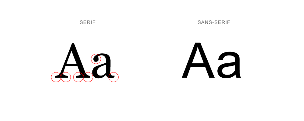
Typography is where art meets words. It’s about choosing the right fonts and arranging them in a way that makes your text not just readable but also visually appealing. The right typeface can set the tone for your design—whether it’s professional, playful, or somewhere in between.
– Serif vs. Sans Serif: Serif fonts (like Times New Roman) have those little lines at the ends of letters, giving them a classic, elegant feel. Sans serif fonts (like Arial) are cleaner and more modern, perfect for a sleek, contemporary look.
– Font Hierarchy: Imagine your text as a roadmap—you want the important stuff to stand out. By playing with font sizes, weights, and styles, you can guide your audience through your content like a pro.
The Rule of Thirds: Your Secret Weapon
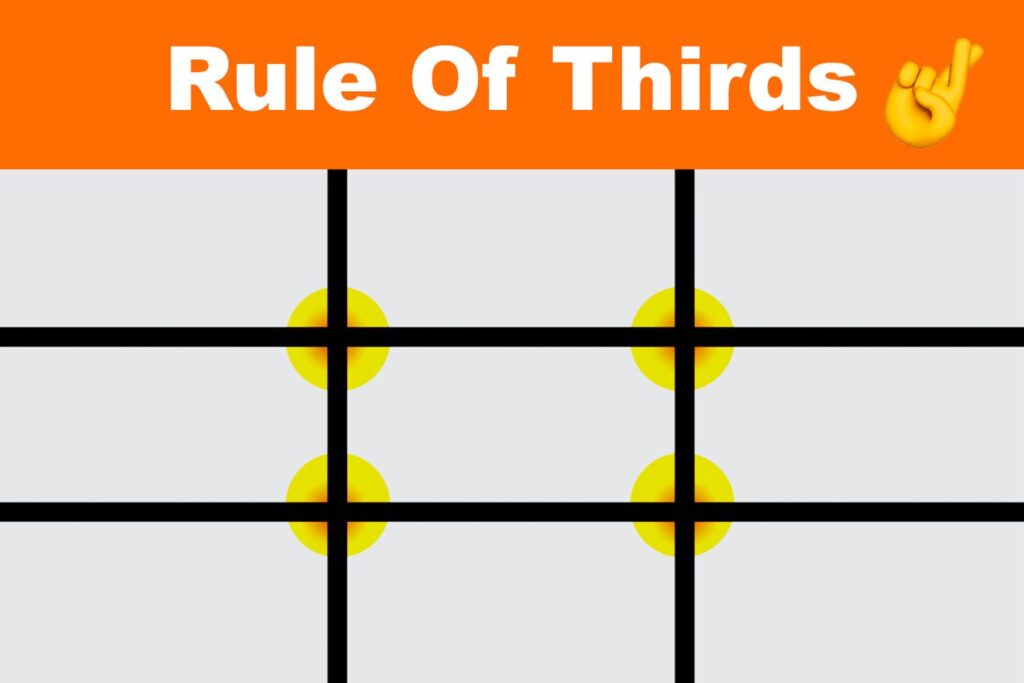
The rule of thirds is like the golden ratio for design. It’s a simple trick borrowed from photography that helps you create balanced, engaging compositions. Imagine dividing your design into a grid of nine equal parts—placing your key elements along these lines or at their intersections makes your design naturally more appealing. It’s like magic!
Getting Creative with Advanced Techniques
Embrace the Power of White Space
White space isn’t just blank space—it’s your best friend in design. It gives your work room to breathe, making your content easier to digest and your design more polished. Plus, it adds a touch of sophistication and helps important elements stand out.
– Less is More: Sometimes, taking things out is more effective than adding more in. Use white space to let your designs breathe and focus on what really matters.
– Focus and Clarity: With the right use of white space, you can guide your viewer’s eye right to the most important parts of your design, making sure your message comes across loud and clear.
Grid Systems: Keep It Organized
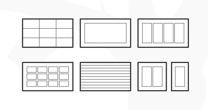
Grids might sound boring, but they’re actually the backbone of any great design. They help you keep everything in line—literally. By using a grid, you can create balanced, consistent layouts that are easy to read and visually pleasing.
– Modular Grids: Think of these as your go-to for structured layouts. They break your design into neat sections, making everything look organized.
– Column Grids: Perfect for web design and print, column grids help you create layouts that are easy to navigate and look super clean.
Play with Contrast
Contrast is like adding a pinch of salt to your dish—it enhances all the flavors and makes the whole thing pop. In design, contrast helps different elements stand out, making your work more dynamic and engaging.
– Color Contrast: A splash of dark against light (or vice versa) can make elements jump off the page. Think about using contrasting colors to draw attention where it matters.
– Size Contrast: Mixing up sizes—big headlines with smaller text, for example—creates a clear visual hierarchy and keeps things interesting.
– Textural Contrast: Want to add depth to your design? Combine smooth textures with rough ones to create visual interest and make your design more tactile.
Practical Tips for Better Designs
Start with a Strong Concept
Every great design starts with a great idea. Before you even think about opening your design software, take some time to brainstorm and develop a solid concept. It’s like building a house—you need a strong foundation before you start putting up walls.
– Mind Mapping: Grab a pen and paper and start jotting down ideas. Connect the dots, and see where your thoughts take you. It’s a fun way to get the creative juices flowing.
– Sketching: Before diving into the digital world, sketch out your ideas. It’s a low-pressure way to explore different layouts and concepts.
Stay Organized (Even When You’re Feeling Creative)
Organization might not sound exciting, but it’s a lifesaver when you’re deep in a project. Keeping your workspace tidy—both physically and digitally—helps you stay focused and efficient, leaving more time for the fun, creative stuff.
– File Management: A messy desktop is the enemy of creativity. Keep your files organized with clear naming conventions and a consistent folder structure. You’ll thank yourself later!
– Layering: In your design software, use layers to keep everything in order. Clearly label each layer so you can easily find what you need and make adjustments on the fly.
Sweat the Small Stuff
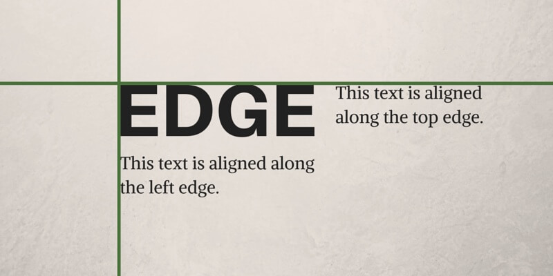
Details matter. Whether it’s the alignment of your text, the spacing between elements, or the tiny embellishments, getting the details right can take your design from good to great.
– Alignment: Make sure everything lines up perfectly—nothing says amateur like misaligned text or images.
– Consistent Spacing: Keeping the spacing between elements consistent is a simple way to create a polished, professional look.
Keep Learning and Experimenting
The design world is constantly evolving, with new trends, tools, and techniques popping up all the time. Staying curious and open to learning is the key to keeping your designs fresh and innovative.
– Online Tutorials: Platforms like YouTube and Skillshare are goldmines for learning new design tricks. Whether you’re a beginner or a seasoned pro, there’s always something new to discover.
– Design Challenges: Push yourself out of your comfort zone by participating in design challenges. They’re a fun way to practice new skills and try out new ideas.
Watch Out for These Common Mistakes
Don’t Overcomplicate Things
It’s easy to get carried away and try to include too much in your design. But more isn’t always better. Overcomplicating your design can overwhelm your audience and dilute your message.
– Keep It Simple: Focus on one or two key elements and build your design around them. Less really can be more.
– Limit Your Fonts: Stick to two or three fonts that work well together. Using too many fonts can make your design look chaotic.
Remember Who You’re Designing For
Your design isn’t just about what looks good to you—it’s about what resonates with your audience. If you forget to consider who will be seeing your design, you might miss the mark entirely.
– Know Your Audience: Spend some time understanding your audience’s preferences, needs, and expectations. This will help you create designs that connect with them.
– Test and Refine: Don’t be afraid to get feedback and tweak your design based on what you learn. A/B testing can also help you figure out which elements work best.
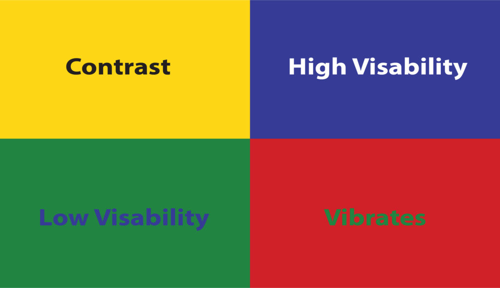
Make Accessibility a Priority
Design is for everyone, so it’s important to make sure your work is accessible to as many people as possible, including those with disabilities. This isn’t just about being inclusive—it also helps you reach a wider audience.
– Color Contrast: Ensure your text is readable by using strong contrast between text and background colors, especially for people with visual impairments.
– Alt Text: Always include descriptive alt text for images so that your content is accessible to screen readers.
The Tools Every Designer Needs
Essential Design Software
Having the right tools can make a world of difference in your design process. Investing in good design software will help you work more efficiently and produce higher-quality work.
– Adobe Creative Suite: The industry standard, this suite includes Photoshop for editing images, Illustrator for vector designs, and InDesign for layouts.
– Affinity Designer: A powerful and affordable alternative to Illustrator, perfect for vector design work.
– Sketch: A favorite among web and UI designers, Sketch is a vector-based tool that simplifies the design process.
Handy Resources and Libraries
There’s no need to start from scratch every time. Take advantage of online resources to enhance your designs and speed up your workflow.
– Fonts: Check out Google Fonts or Adobe Fonts for a wide selection of typefaces, both free and premium.
– Stock Photos: Need some high-quality images? Unsplash, Pexels, and Shutterstock have you covered.
– Icons: Flaticon and Iconfinder offer a huge range of icons to spice up your designs.
Conclusion
Graphic design is an ever-evolving craft that combines creativity, technical skills, and attention to detail. By mastering the basics, experimenting with advanced techniques, and avoiding common pitfalls, you can take your designs to the next level and create visuals that not only look stunning but also effectively communicate your message. Remember, the best designs are often the ones that seem simple and effortless but are backed by a deep understanding of design principles and a clear creative vision.
As you continue on your design journey, keep pushing your boundaries, stay curious, and never stop learning. The more you experiment and refine your skills, the more confident and proficient you’ll become. Whether you’re designing for a client, your own projects, or just for fun, these tips will help you create work that you’re proud of—and that stands out in a crowded digital world.
So, go ahead—fire up your design software, play with colors and fonts, and most importantly, have fun with the process. After all, graphic design is about creativity, expression, and making the world a little more beautiful, one design at a time. Happy designing!